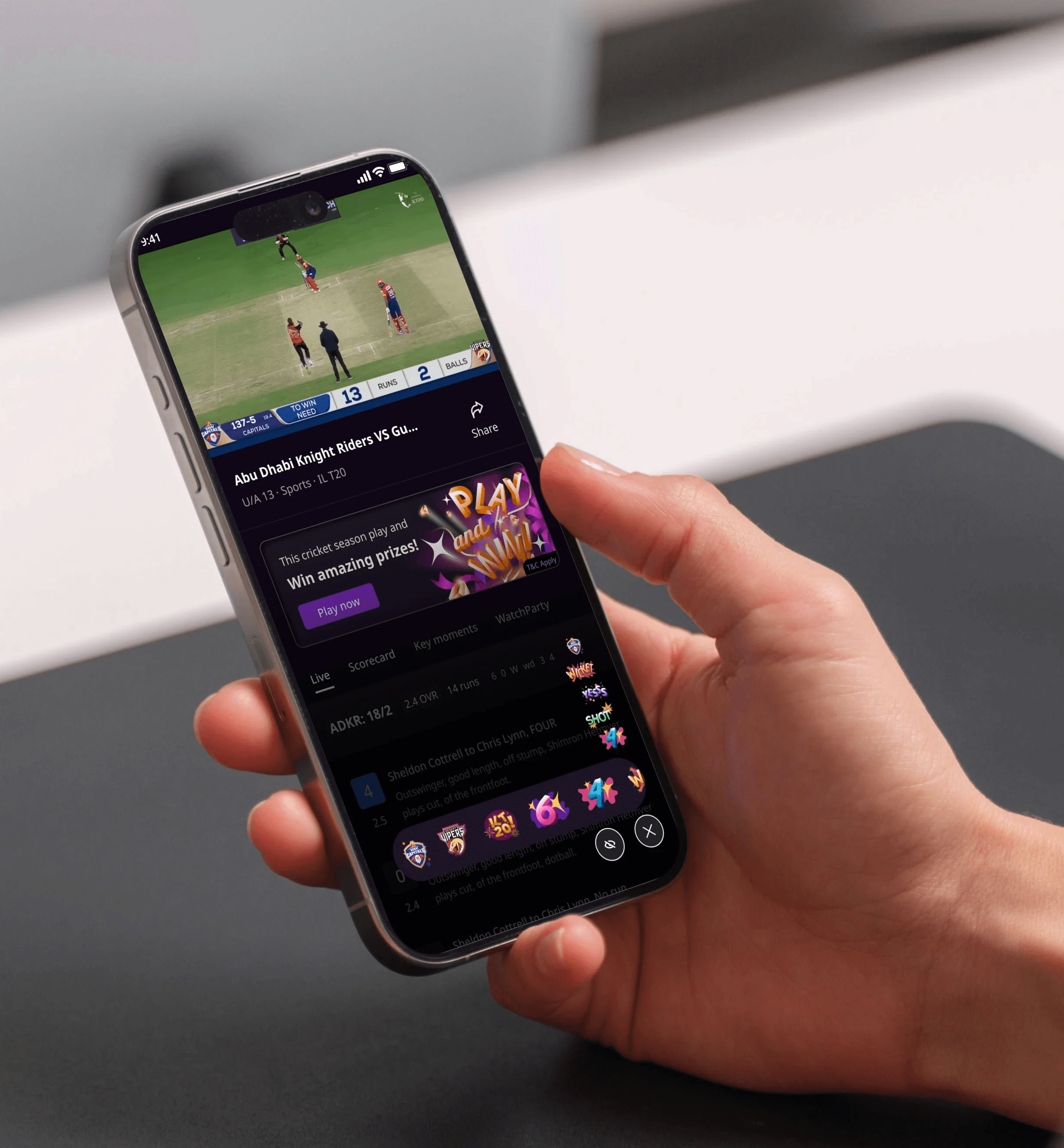
ILT20 Cricket League Rebranding ft. Zee5
Rebranding of the ILT20 Cricket League under Zee Entertainment
Role
Visual Designer, Illustrator
Industry
Sports and Entertainment
Duration
2 months


Stage 4. Final Visuals
Celebratory Stickers

We can see the hierarchy of the colors and the use of the 2d and 3d elements combined here.
Team Logo Stickers

To create stickers from the existing team logos, I focused on maintaining color contrast, coherency, and the integrity of their shapes.
Watchparty Illustration

I was tasked with creating an illustration for the IT20 League watch party feature, depicting a group of three friends watching the match together. I used the existing character library system, ensuring simplicity in the human forms for clarity across various devices, from phones to TVs, while maintaining enough breathing space in the design.

Other projects

Spice 'n Dice, a food recipe board game
Welcome to Spice 'n Dice, where the kitchen turns into a battlefield for your favorite flavors! Gather ingredients, complete recipes, and out-cook your friends. Every turn is a step closer to delicious victory — or a tasty disaster. Let the cooking begin.

Zee 'Sorted News' App Illustrations
Designing full length illustrations for a new and cutting edge news app

Zee5 home page language rail typography
Reasearching and ideating on a Zee5's home page language rail typography
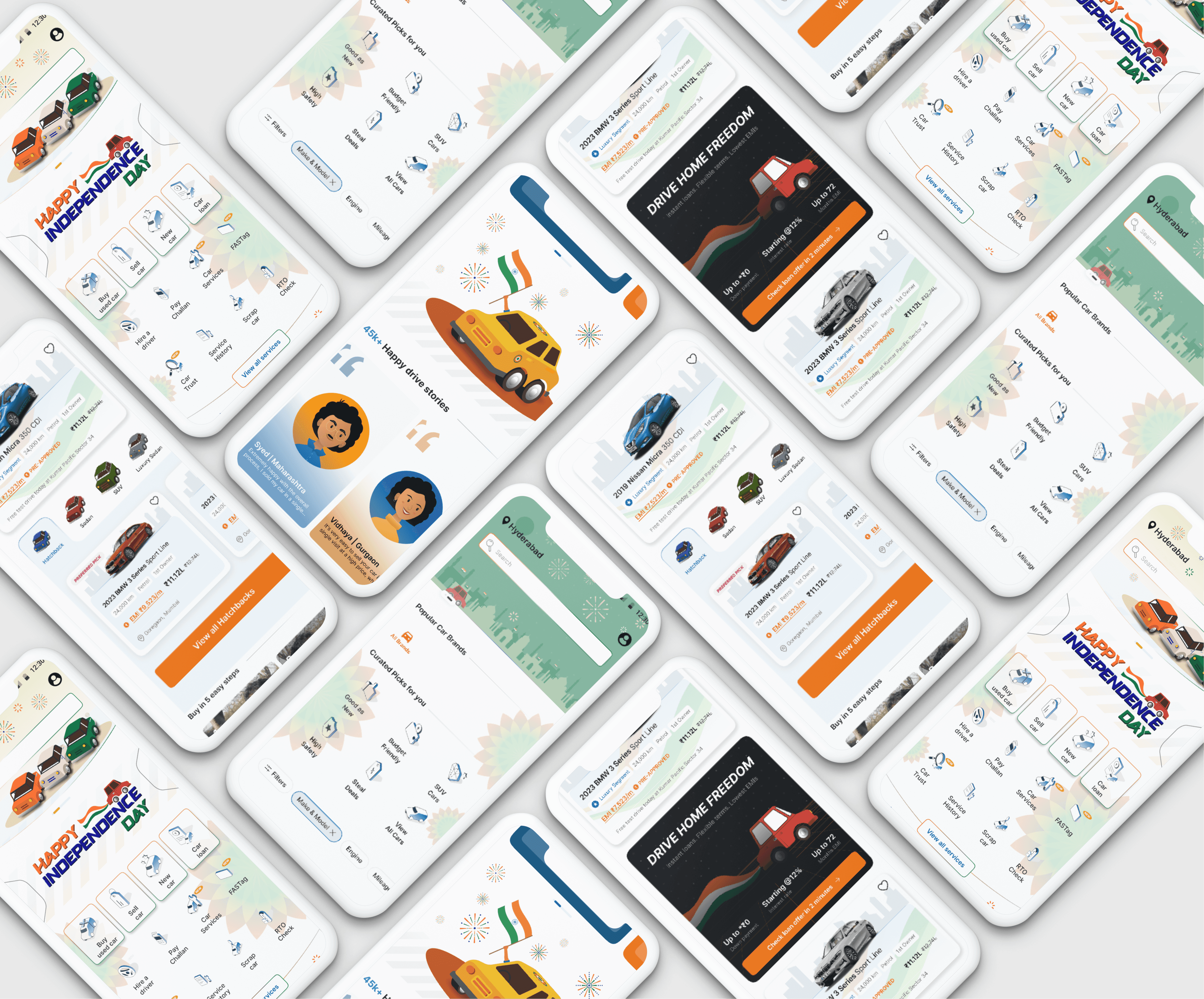
Designing an Illustration system for Cars24
Conceptualizing and creating an Illustration system and brand for Cars24

