Visualising Juspay & Hyperswitch

Storyboarding, creating key style frames and other creatives for Juspay and Hyperswitch

Role

Visual Designer, Illustrator

Industry

FinTech Industry

Duration

1 week

Stage 1. Objective

The objective of this project was to create visual storyboards and key style frames for a motion graphic video for Hyperswitch (built by Juspay), based entirely on a provided script. The visuals needed to align with Hyperswitch’s branding and communicate the clarity and effectiveness of their role as a payment orchestrator in the global finance market.

Additionally, the project involved creating creatives for Juspay, including an emailer explaining their payout solutions.

Stage 2. Understanding the brand language

To begin creating the visuals, I first thoroughly explored the Hyperswitch website to understand their brand language. I also reviewed every available vlog and online content about them to deepen my understanding of their style and ensure consistency in my designs.

At first glance, their website exudes modernity while maintaining utmost clarity. It cleverly combines 2D and 3D elements in the same space, giving each equal importance and impact.

The strategic use of blue, which is also the logo color, paired with white from the logotype, creates a sophisticated and cohesive look that defines their overall branding.

As we explore further on the website, additional brand colors emerge, adding vibrancy to the overall look, especially against the dark UI, which gives it a chic and modern feel.

The typography is a thoughtful blend of bold and light weights, with white strategically used to highlight key elements like headings, ensuring clarity and focus.

As we move further, the alternating use of light and dark UIs breaks the monotony, adding a sense of tech-forward sophistication to the design. We also encounter brand shapes—circles, squares, and triangles—that mirror the logomark, creating a sense of consistency and playfulness.

The brand colors identified earlier are used effectively throughout, enhancing the visual cohesion and vibrancy.

The illustrations are often blocky yet appear direct and creative, clearly conveying the message alongside the content. This simplicity makes the visuals easy to understand for a global audience, regardless of age or background, enhancing overall accessibility and communication.

Stage 3. Creating the storyboards

After conducting in-depth research into the brand language, I proceeded to storyboard the provided script. Each frame is paired with the corresponding statement from the script.

Additionally, there are some handwritten notes included in the storyboard, which may not be fully legible, so we’ve provided detailed explanations for each frame to enhance understanding.

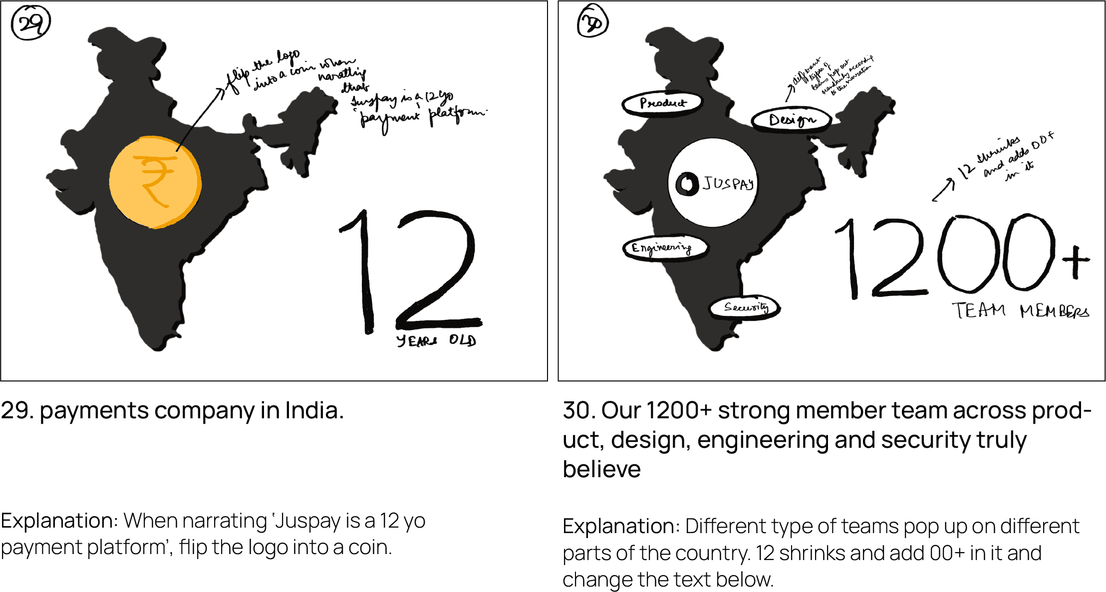
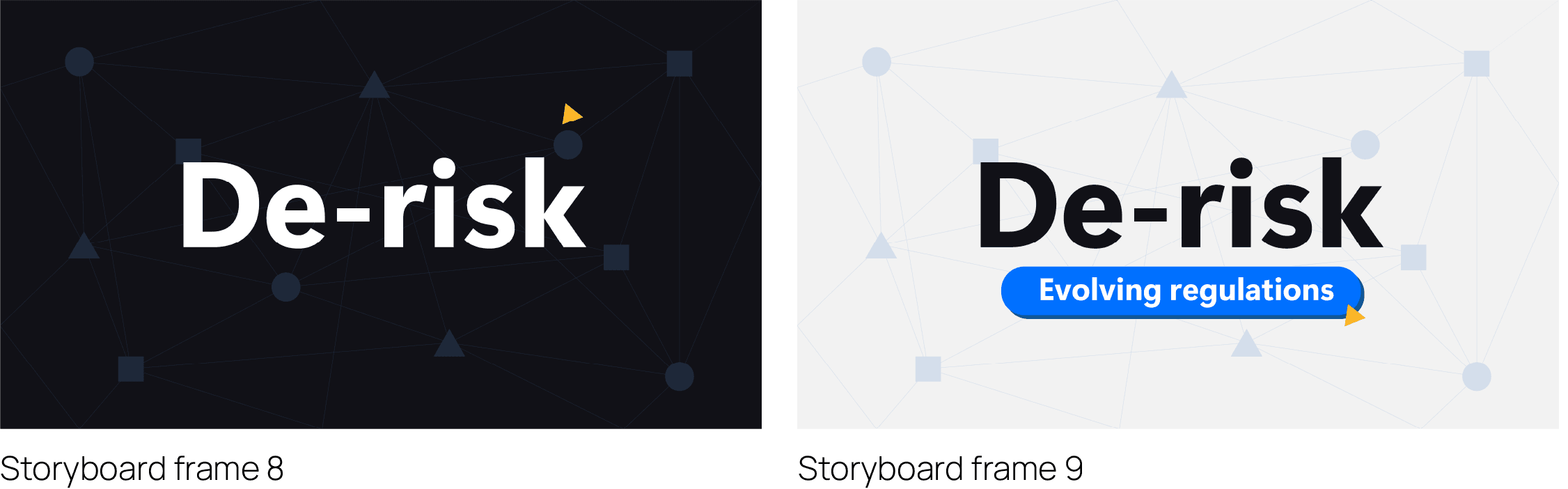
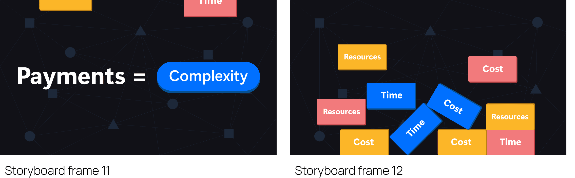
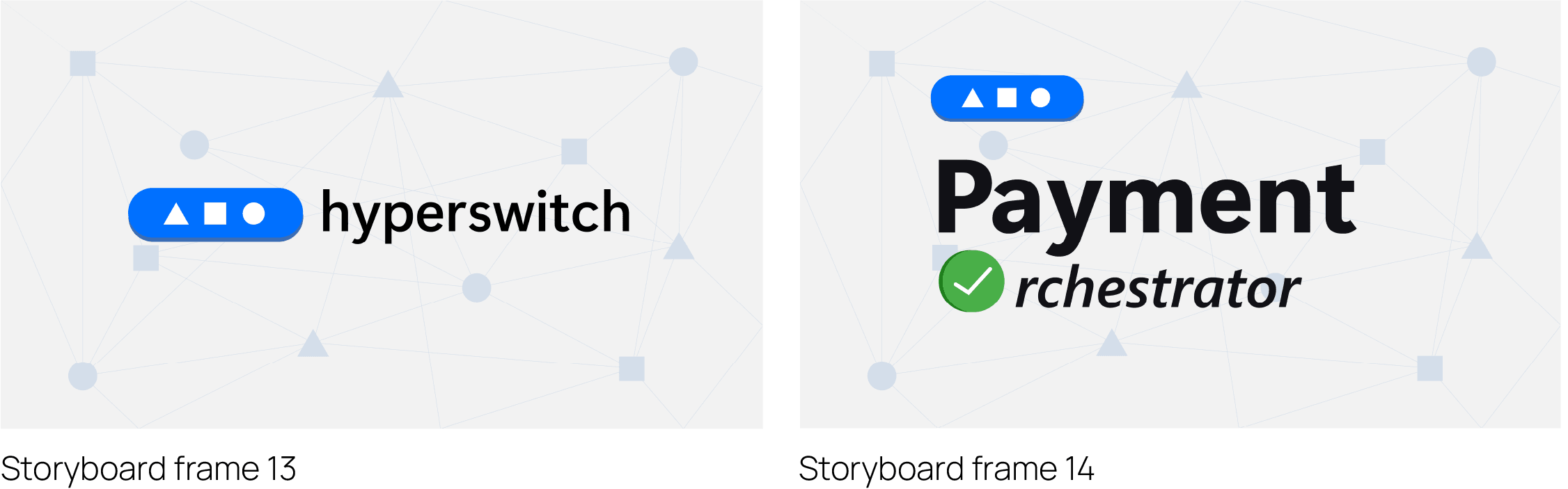
Stage 4. Making key style frames

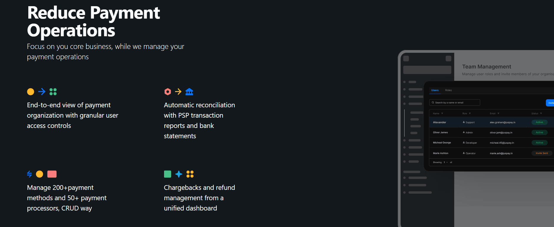
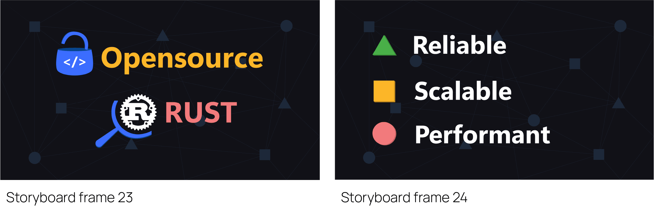
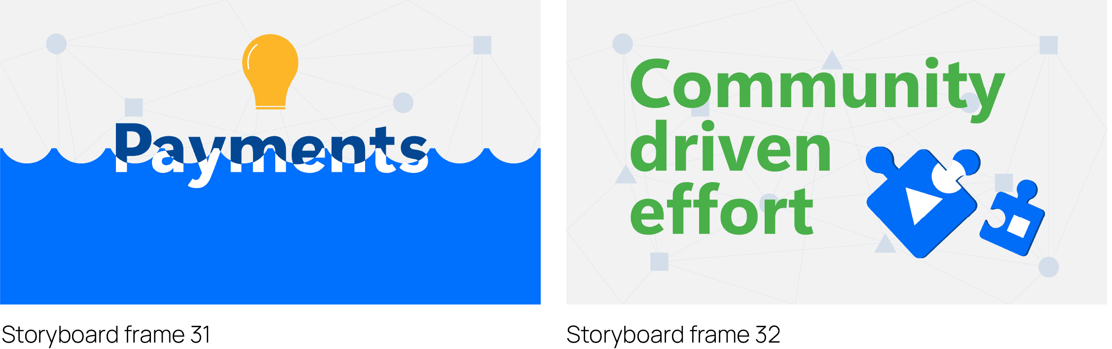
After numerous black-and-white sketches, we move on to the colorful phase: the style frames. Simply put, style frames are the high-fidelity versions of the low-fidelity storyboards.

In this phase, we incorporate findings from the brand study, using alternating light and dark UIs with the Segoe UI font. For the light UI, I chose a grey undertone (#f2f2f2) instead of pure white to avoid eye strain from a harsh contrast.

The background features a subtle digital network design, with nodes shaped like the Hyperswitch brand elements—circles, squares, and triangles—reinforcing the idea of seamless functionality on a digital platform.

Stage 5: Ideating and creating the Emailer

For my final task, I needed to conceptualize a brand style and create an emailer for Juspay based on their payout system write-up.

My goal was to keep the emailer simple yet creative and eye-catching, ensuring it aligned with the brand’s colors and fonts previously discussed. I aimed for an illustrated design that was both clear and engaging.

Other projects

© Created with love, fueled by sleepless nights, and just a few, or maybe a bit more tears

© Created with love, fueled by sleepless nights, and just a few, or maybe a bit more tears

© Created with love, fueled by sleepless nights, and just a few, or maybe a bit more tears